1jsilver2
I happened upon a second copy of The Secret Garden at a thrift store today and figured I would swap slipcases to keep the nicer of the 2 books and the nicer of the 2 slipcases. Then I realized that the one book (2007 printing) does not fit in the other book's (2010 printing) slipcase. I guess they used thinner paper in the 2010 printing, making the book and slipcase slightly thinner.
I just found this interesting. Have others noticed this sort of change between printings before?
I just found this interesting. Have others noticed this sort of change between printings before?
2bacchus.
There’s often differences between reprints of same design. Reprints in China (C & C) were common at one point, where the paper is a bit more glossy (Jilong Pure). Greek Myths (around 1996, the one volume edition) was even reprinted with black and white paintings, compared to red and brown, if I’m not mistaken. There are few examples mentioned throughout this forum, but none come specifically to mind.
3drizzled
>1 jsilver2: A "downgrade" in the binding material occurred for "A Clockwork Orange" – the creative snakeskin alike paper cover was replaced with a bland buckram. The orange hue changed for the worse too
4User2024
>3 drizzled: this is a big one because the original A Clockwork Orange binding is one of my favorites for a standard edition and is an example of a paper binding punching above its weight class.
5HonorWulf
The Tolkien standard editions have declined over the years, imo. Hoping for a refresh at some point.
6Cat_of_Ulthar
Good idea to have a separate thread for this. I can't remember every comment I read but this one stuck in my mind and a little searching dug it out.
An upgrade for the John Wyndham set per this comment: https://www.librarything.com/topic/356497#8347998
Edited to correct link.
An upgrade for the John Wyndham set per this comment: https://www.librarything.com/topic/356497#8347998
Edited to correct link.
7David_Mauduit
Not really a change in the quality of the binding but The New York Trilogy gained an introduction in the second printing.
>5 HonorWulf: what has changed?
>5 HonorWulf: what has changed?
8HonorWulf
>7 David_Mauduit: The paper binding and foil seem to be more prone to flaking and reading wear as they've switched printers over the years.
9ambyrglow
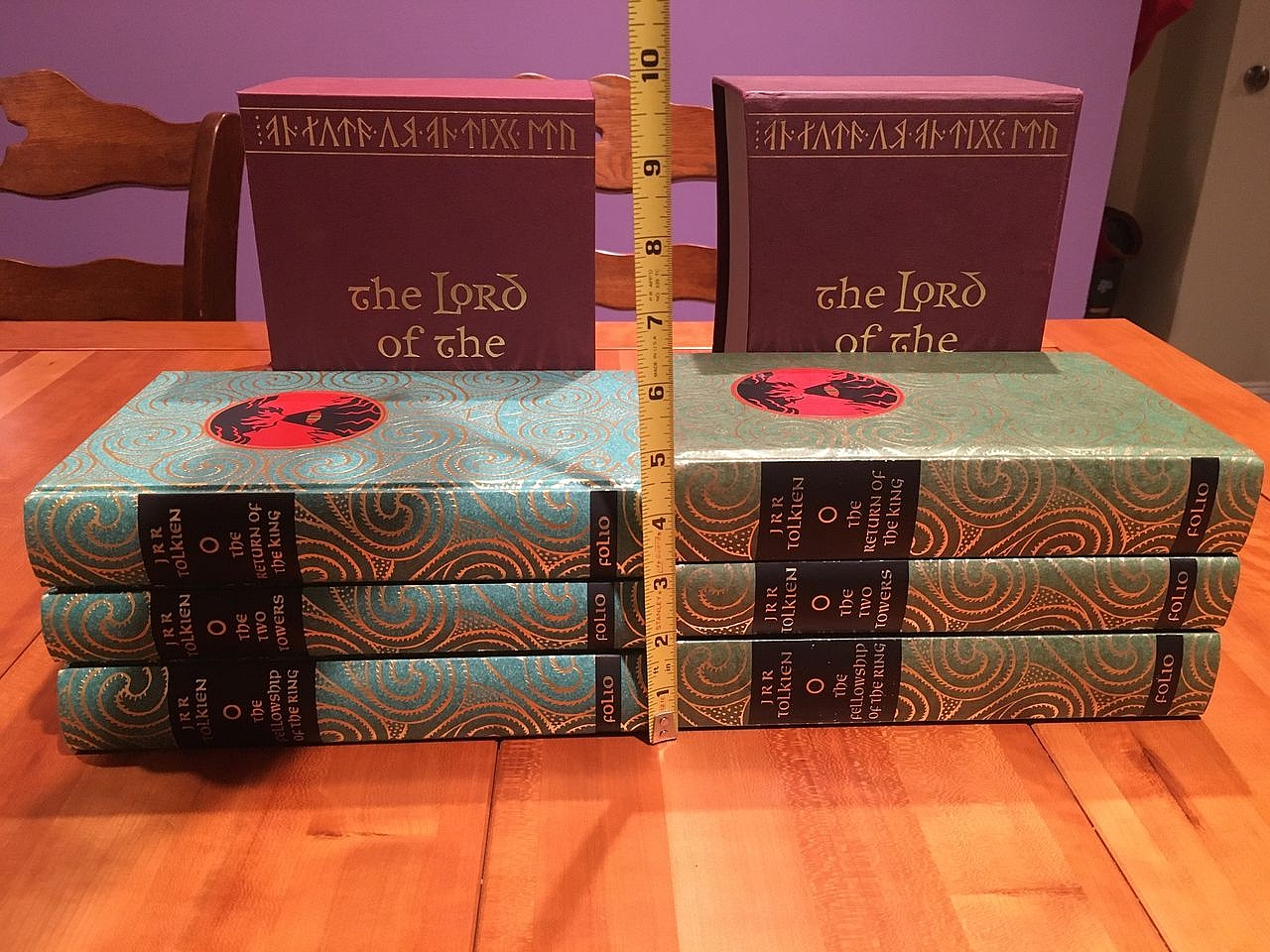
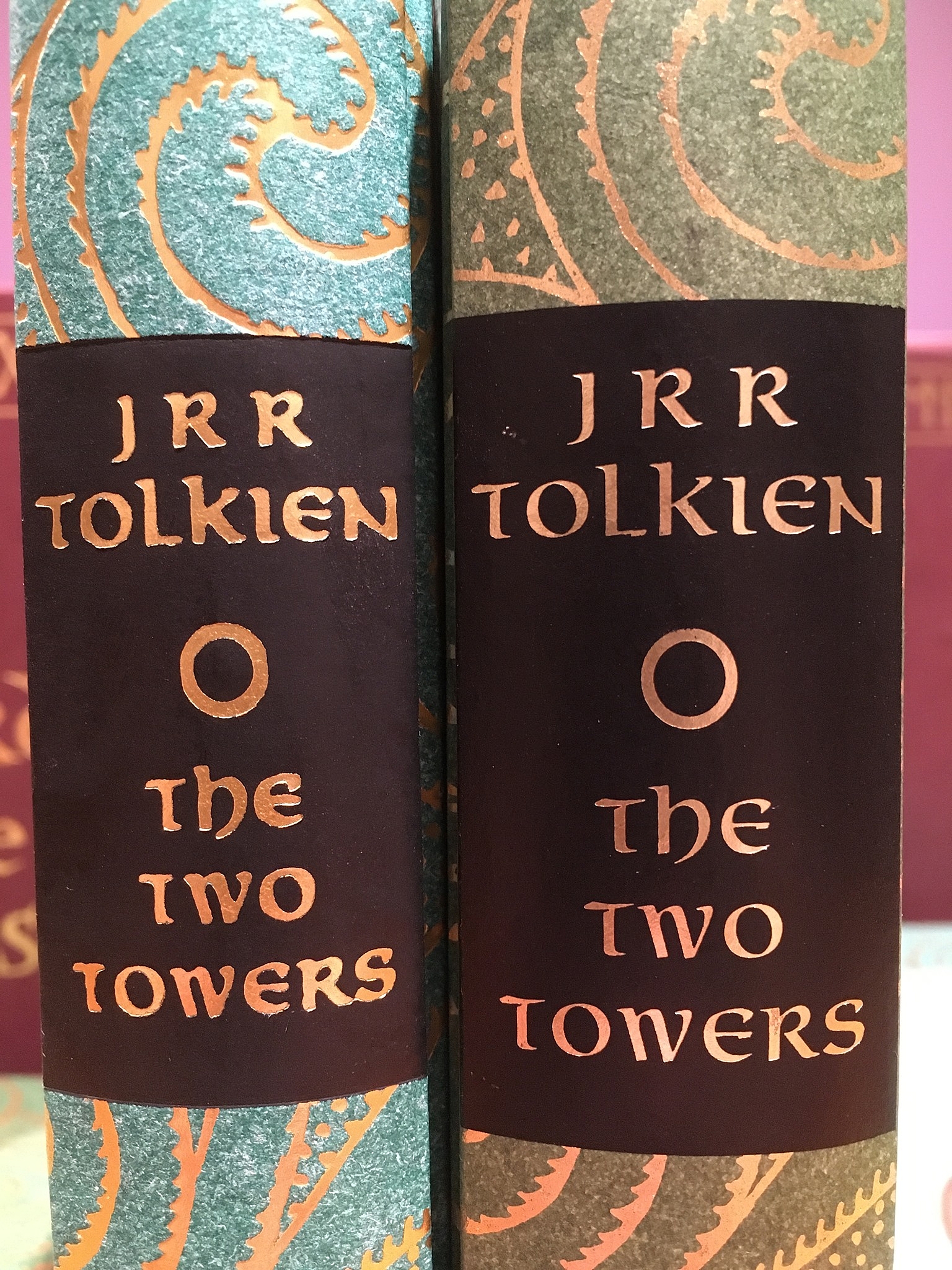
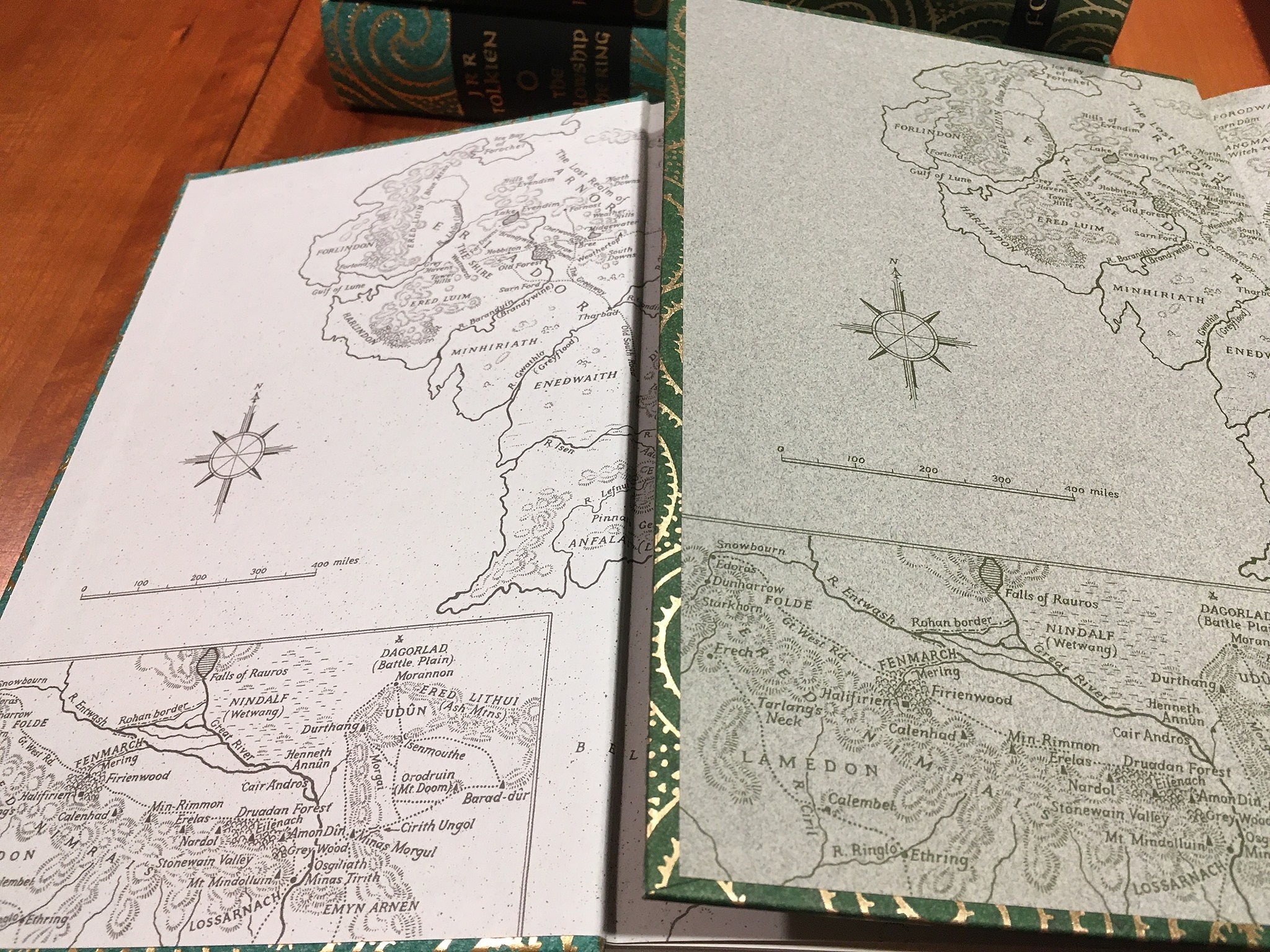
Here's some compare and contrast images I took of the 6th and 19th printings of Lord of the Rings for the Facebook group a few years back. A list of differences:
1) The 6th printing is half an inch thicker than the 19th printing
2) Despite this, the 6th printing is also half a pound _lighter_ than the 19th printing
3) The 6th printing is a sort of pine green; the 19th is more of a teal
4) The 6th printing has green endpapers; the 19th has off-white with a faint green tinge
5) The 6th printing has the illustration on page 217 of The Two Towers in the correct orientation; the 19th printing has it upside down and cropped
6) The 6th printing (interior St. Paul's Wove, binding vegetable parchment) has rougher texture to its interior paper than the 19th printing (interior Yu Long Pure, binding Napura) but smoother texture to its cover paper
7) The 6th printing has a slight curve to the slipcase edge to facilitate removing volumes; the 19th printing has a straight edge to its slipcase
8) The 6th printing has almost no perceptible textural difference between the green and gold on the cover; the 19th printing has deep embossing
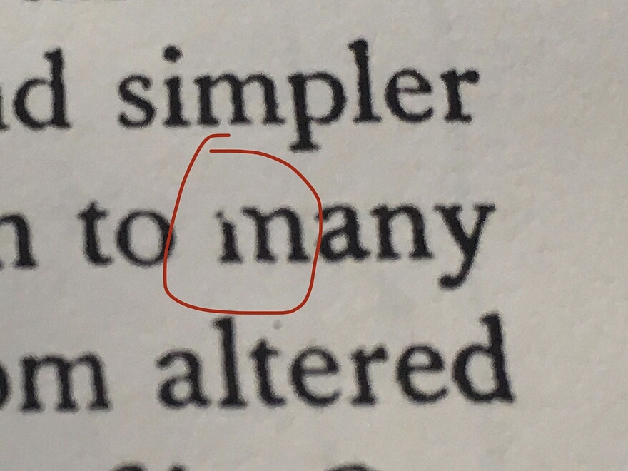
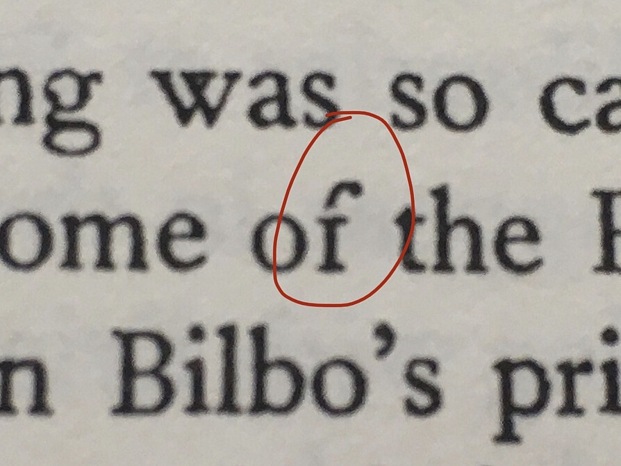
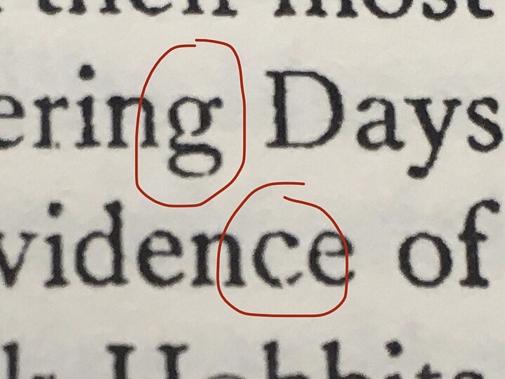
9) The 19th printing has many characters that haven't been fully inked, leaving white gaps; the 6th printing has crisp, clear printing
19th printing on left, 6th printing on right:


10Pendrainllwyn
>9 ambyrglow: Eye-opening. I was naively indifferent to which printing I purchased until now.
11wcarter
>9 ambyrglow:
Fascinating and strangely distressing.
Fascinating and strangely distressing.
12drizzled
>9 ambyrglow: Wow. Many thanks for sharing
13ambyrglow
Some examples of the not fully inked characters in the 19th printing that I mentioned:
And the upside down/cropped Two Towers illustration (correct illustration in 6th printing on left, illustration with errors in 19th printing on right; if you're wondering "what is that supposed to be illustrating," it is rather abstract but it's a storm coming in over a mountain range):

Anyway, the summary here is that after some argument with the Folio Society I got a refund for the 19th printing, donated that set to charity, and kept the 6th printing on my shelf.


And the upside down/cropped Two Towers illustration (correct illustration in 6th printing on left, illustration with errors in 19th printing on right; if you're wondering "what is that supposed to be illustrating," it is rather abstract but it's a storm coming in over a mountain range):

Anyway, the summary here is that after some argument with the Folio Society I got a refund for the 19th printing, donated that set to charity, and kept the 6th printing on my shelf.
14HonorWulf
>9 ambyrglow: Yikes! Thanks for posting that. Those changes seem to coincide with the shift to China around ten years ago. Apparently, the latest printing shifted to Germany and has some improvements but is still a far cry from the early Bath printings.
15ambyrglow
>14 HonorWulf: I'd love to know if they have the illustration right side up again! That's the thing that drives me nuts the most. (Well, the bad printing bothers me more from a reading perspective, but the upside-down illustration is the most "how did you manage to screw that up?" And it's not just the 19th printing that had it upside down--several printings before and after that did as well.)
16Ragnaroekk
>15 ambyrglow:
If I look at that specific illustrations I'm not sure which one is the wrong one myself 😂
If I look at that specific illustrations I'm not sure which one is the wrong one myself 😂
17HonorWulf
>15 ambyrglow: Yes, a poster on Reddit confirmed that the new German printing has the illustration fixed. However, many other quality issues seem to remain.
18antinous_in_london
I ordered a hardback book last week from Amazon that was published 2 months ago by a major publisher & (as expected with amazon) it arrived damaged so i ordered a replacement. When it arrived the same book with the same ISBN was totally different in quality. The original copy was printed in Slovakia with a really cheap feeling cover & mediocre print quality, the replacement was printed in Scotland with a really nice soft-touch lacquered cover & much superior printing inside. For once I'm happy that Amazon sent me a damaged book as i otherwise wouldn’t even have known there was a better quality version out there - i wonder how many different qualities of books there are floating around under the same ISBN.
19cronshaw
Two recent FS reprints have mystified me: Tony Morrison's Beloved and Tom Wolfe's The Right Stuff. The reprinted Beloved has suffered one of the most unlovely binding makeovers I've seen, the original full cloth binding has been replaced with quarter cloth over paper boards in the dullest colours imaginable. Meanwhile, the 49 mostly colour photographs that had illustrated the first printing of The Right Stuff were replaced by an artist's illustrations in the reprint; given the historical basis of the work this decision puzzled me. The printing with the photographs gives such a fuller, more accurate picture of the events that actually unfolded, and Tom Wolfe writes so well that I couldn't imagine ever parting with my first Folio printing of this work.

