1abysswalker
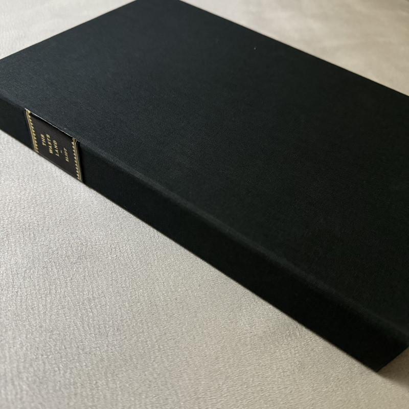
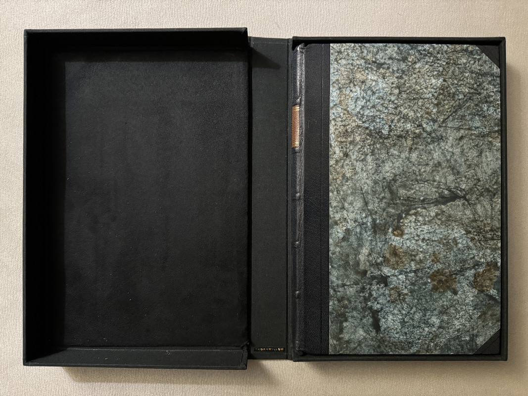
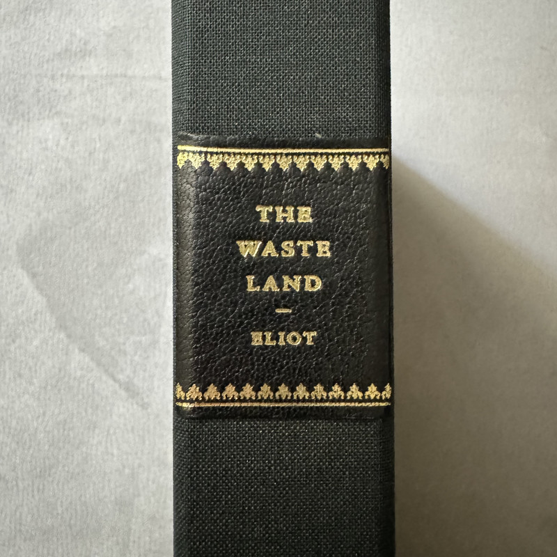
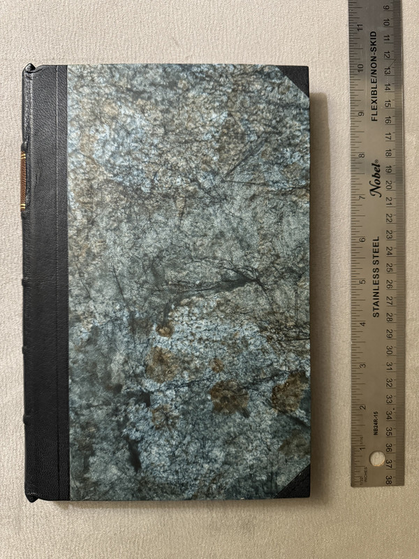
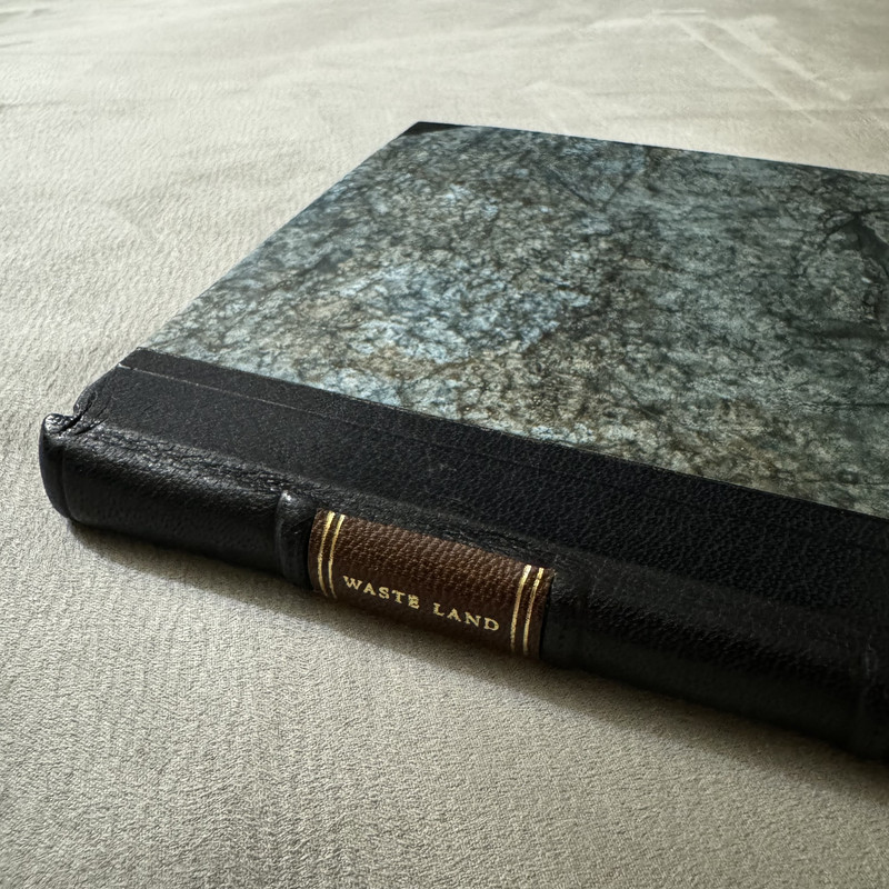
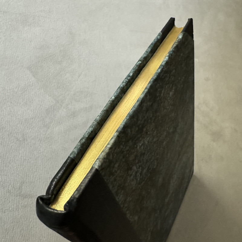
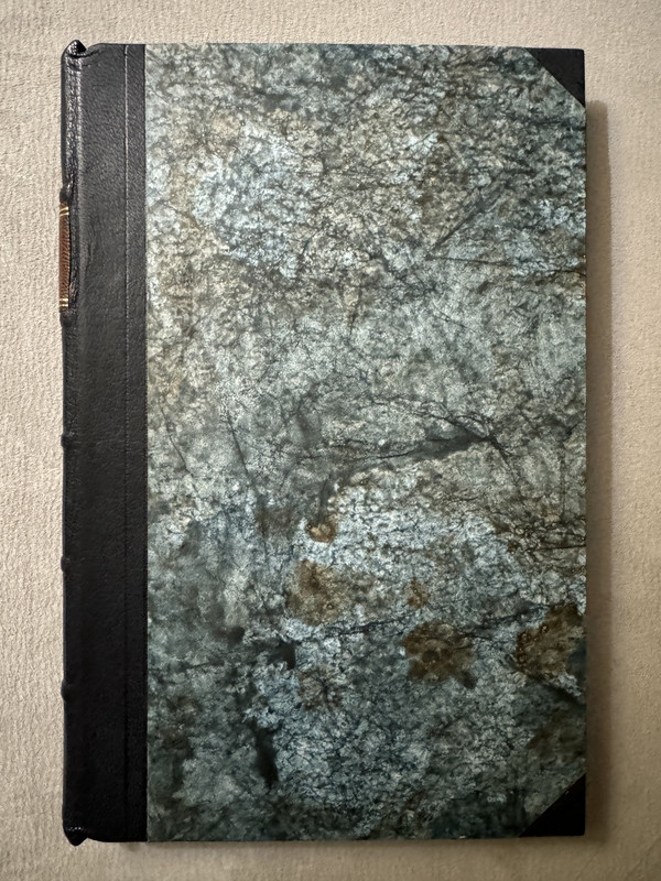
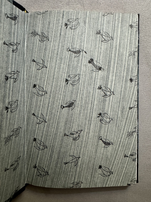
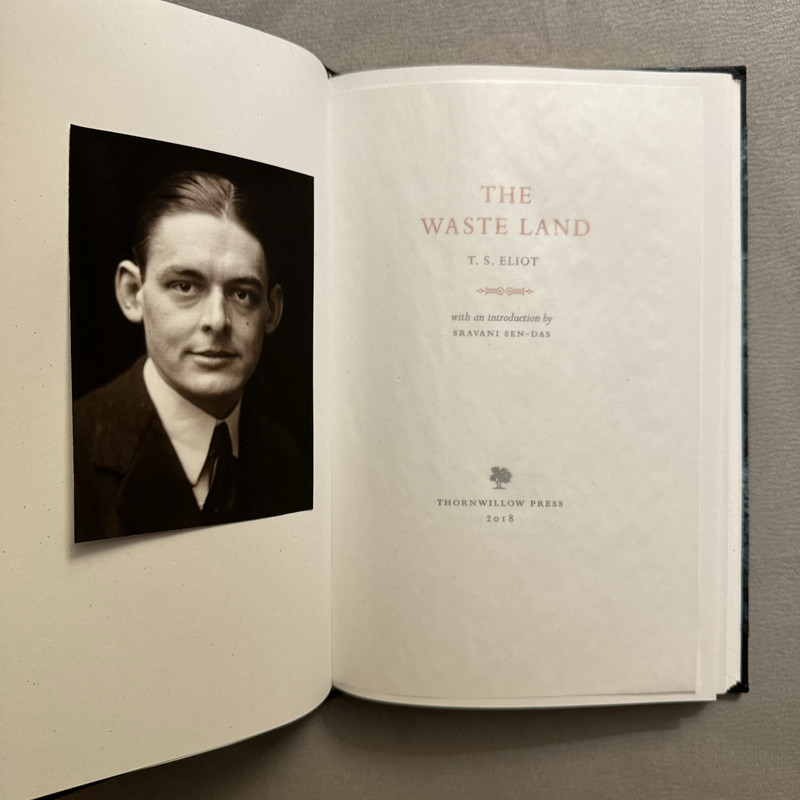
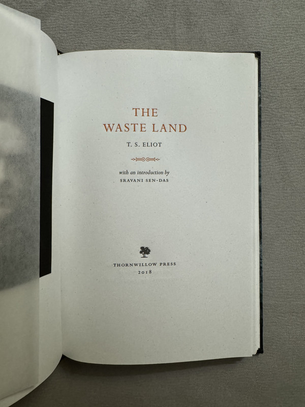
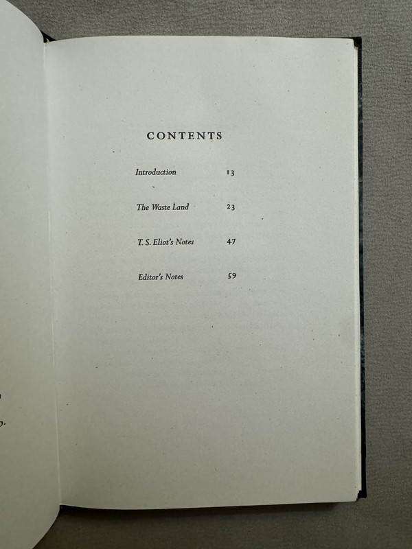
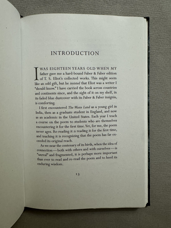
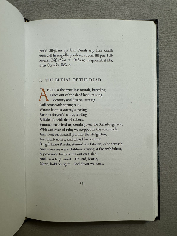
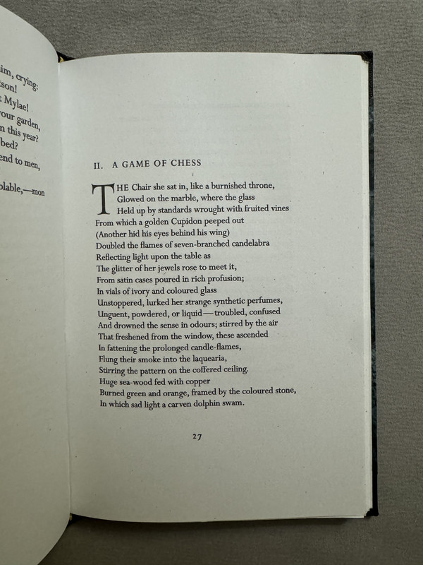
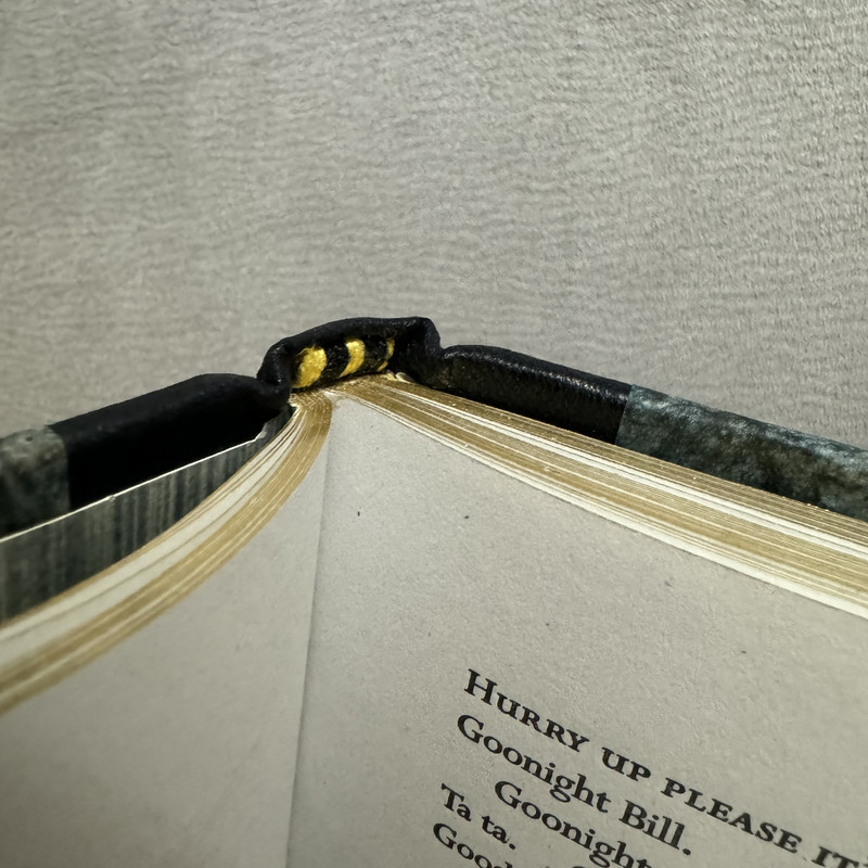
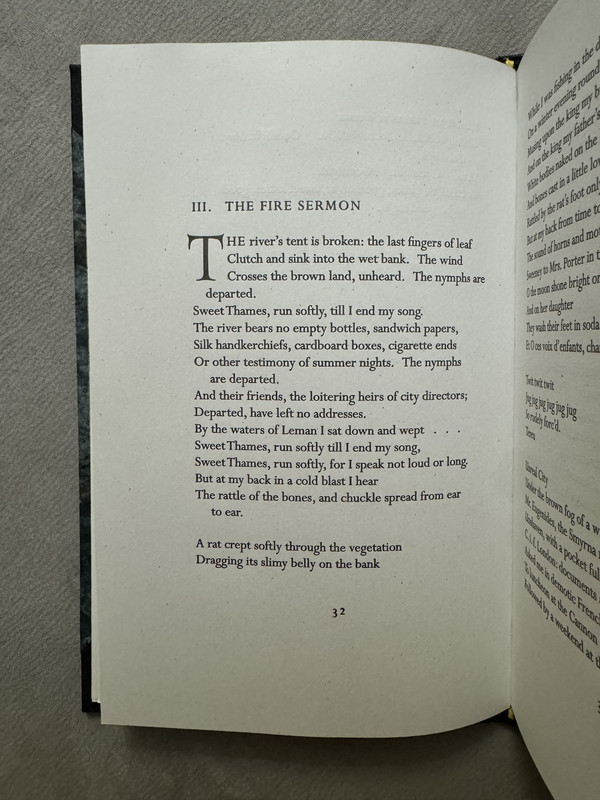
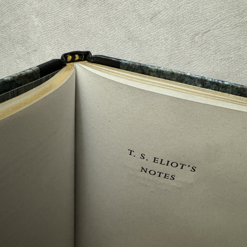
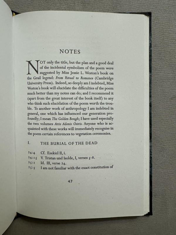
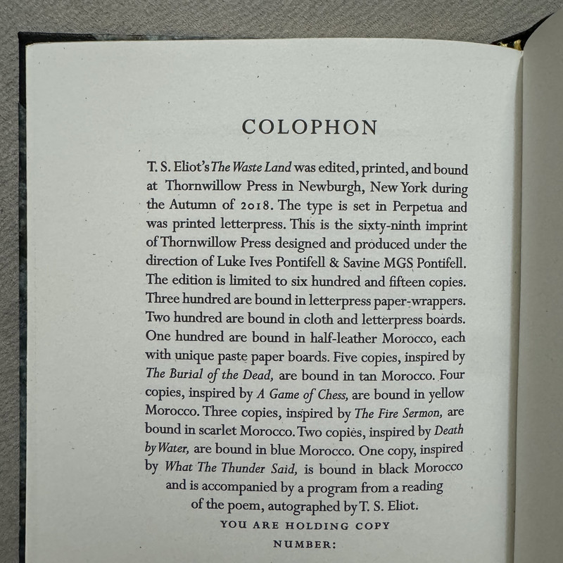
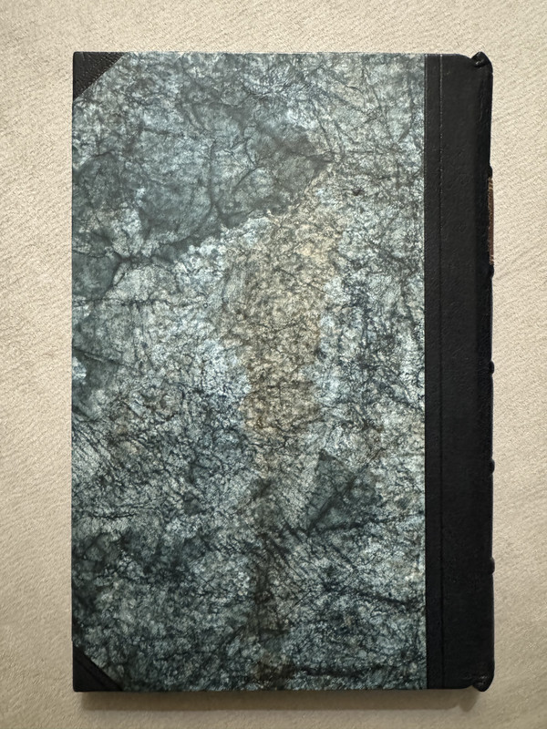
Prompted by a query in another thread, here are some photos of the Thornwillow edition of The Waste Land. This is one of 100 copies bound in half leather with paste paper over the boards.
It is unillustrated, though as you can see from the photos at least this state includes a tipped in frontispiece depiction of the author.
The paper has a slight blueish tint which may or may not come through in these photos. According to this comment, the paper used is Mohawk milkweed from their Loop collection, though this is not specified in the book itself.
If money were truly no object, I might go for the Officina Bodoni edition, which is almost certainly a finer book in terms of absolute quality, but the Mardersteig design is more Mardersteig than it is Eliot. The Thornwillow edition feels like a more natural expression of the poem, to me.
Click through for larger photos on the image hosting site. I think you can click again there to get even higher resolution.


2GardenOfForkingPaths
>1 abysswalker: Thanks for posting. The paste paper used for the covers is lovely, and the layout looks good too.
I regret missing this one. I'm in the market for a nice edition of The Waste Land but Thornwillow have raised the price of the paper wrapper edition to $350. It was $85 during the Kickstarter in 2020. I would expect some increase post-campaign and adjusting for inflation, but this seems a bit of a stretch. I'd be interested to hear if any owners think I'm wide of the mark here, though.
I regret missing this one. I'm in the market for a nice edition of The Waste Land but Thornwillow have raised the price of the paper wrapper edition to $350. It was $85 during the Kickstarter in 2020. I would expect some increase post-campaign and adjusting for inflation, but this seems a bit of a stretch. I'd be interested to hear if any owners think I'm wide of the mark here, though.
3abysswalker
>2 GardenOfForkingPaths: $350 USD is probably too rich for me, for the paper wrapper edition.
Worth noting that the Thornwillow price increases are more connected to their idiosyncratic patronage model than to inflation per se. They explicitly increase the price as supply dwindles to provide greater benefit to earlier supporters, as far as I understand it.
Worth noting that the Thornwillow price increases are more connected to their idiosyncratic patronage model than to inflation per se. They explicitly increase the price as supply dwindles to provide greater benefit to earlier supporters, as far as I understand it.
4NathanOv
>3 abysswalker: Little bit of a mix of both, I think. Kickstarter and subscriber prices are always discounted from the website list price, usually by 25-30% but sometimes more, and they do always raise the prices quite a bit on “final” copies of any title.
However, they’ve also added a pretty big markup on all of their stock, regardless of how many copies are available over the past year or two.
That, I’d say, is less general market inflation than being 4-5 new releases behind their pre-pandemic / pre-Ulysses publishing pace.
However, they’ve also added a pretty big markup on all of their stock, regardless of how many copies are available over the past year or two.
That, I’d say, is less general market inflation than being 4-5 new releases behind their pre-pandemic / pre-Ulysses publishing pace.
5AitanaGreen
The Thornwillow edition of The Waste Land is a limited, beautifully crafted version that highlights the poem’s essence. With its half-leather binding and Mohawk Milkweed paper, the edition offers a tactile experience that resonates with the work’s themes. While it doesn't feature illustrations, its design aligns naturally with the poem's mood, making it a unique expression of Eliot's vision. Writing a term paper in my Computer Science program felt daunting, especially with multiple deadlines approaching. I turned to https://academized.com/term-paper-writing-service and their service was fantastic. The term paper was detailed, accurately referenced, and delivered before the deadline. The writer demonstrated expertise in the subject, which earned me excellent feedback from my professor. I’m very grateful for their help and highly recommend their service!
6CabbageMoth
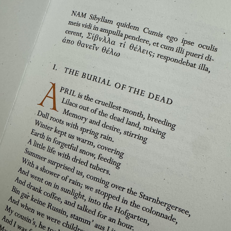
The first Greek word is spelled wrong, right? Either whoever set the type can't distinguish nu from upsilon or the Greek typeface is horribly designed. There should be one of each letter in the epigraph, but they look identical to me (and they both look like nu to me).
7jveezer
That's a beauty! I really like my AP edition but it's big. I can't remember if it's one of those books that Andrew Hoyem made wider to accomodate the intended line width of the poet. When I get a chance I'll compare the AP to the page you showed here...
8lgreen666
I'm still awaiting the NoReply edition which sounds stunning and brings academic weight to the aesthetics
9jdanielpowell
>6 CabbageMoth: Yes, I agree. Here's a comparison:
Arion Press:

Folio Society limited edition:

And Thornwillow:

Arion Press:

Folio Society limited edition:

And Thornwillow:

10astropi
>6 CabbageMoth: >9 jdanielpowell: that's some good eyes you have! I would not have noticed :)
11SebRinelli
>10 astropi: I think it's immediately noticeable if one can read Ancient Greek. It would annoy the hell out of me. 😅
>8 lgreen666: yes, me too! The editions of Prufrock and Preludes (2nd printing) of No Reply are beautiful, particularly the latter. Really looking forward to The Waste Land which is expected to become one of the highlights of the press so far.
>8 lgreen666: yes, me too! The editions of Prufrock and Preludes (2nd printing) of No Reply are beautiful, particularly the latter. Really looking forward to The Waste Land which is expected to become one of the highlights of the press so far.
12ultrarightist
>9 jdanielpowell: So the Folio Society edition got it wrong, too?
13ambyrglow
The nu and upsilon look distinct in the Folio edition to me. It's just Thornwillow that's off.
14Glacierman
Well, it's all Greek to me.
15CabbageMoth
>9 jdanielpowell: Seeing the text blown up like this, my conclusion is that not only didn't Thornwillow proofread, but also that the Greek type is indeed ugly. The Arion and Folio choices are very different from each other, but both look much nicer to me. And now I also have a question about what is going on in the Thornwillow with the accent on apothanein, which looks wrong to me and certainly disagrees with the other versions.
16astropi
Well, I'll be honest, as someone that deals with Greek fairly often because it appears all the time in science, it looks like someone at Thornwillow just got their "v" and nu confused - I personally see this too often to be bothered :)
Yeah, you could argue it's sloppy, but I've seen far worse errors from other editions such the Allen Press (and I love the Allen Press)! That said, it does look like they made three errors right there - The v instead of nu, an extra space, and it almost looks like a % sign over the iota.
Yeah, you could argue it's sloppy, but I've seen far worse errors from other editions such the Allen Press (and I love the Allen Press)! That said, it does look like they made three errors right there - The v instead of nu, an extra space, and it almost looks like a % sign over the iota.

