In Our Time by Ernest Hemingway - COPPERHEAD PRESS LE 2024
TalkFine Press Forum
Join LibraryThing to post.
1wcarter
In Our Time by Ernest Hemingway - COPPERHEAD PRESS HALF-LEATHER LIMITED EDITION 2024
A PICTORIAL REVIEW
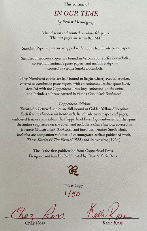
First publication from Copperhead Press.
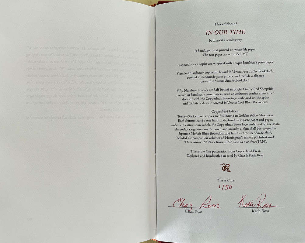
No. 1 of 50 copies.
Designed, hand crafted and signed by Chaz Ross and Katie Ross.
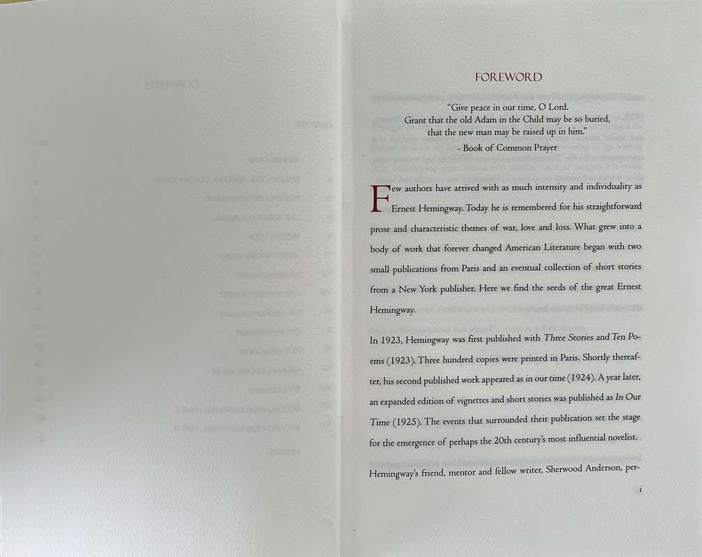
Forward by Chaz Ross.
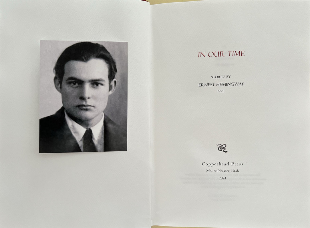
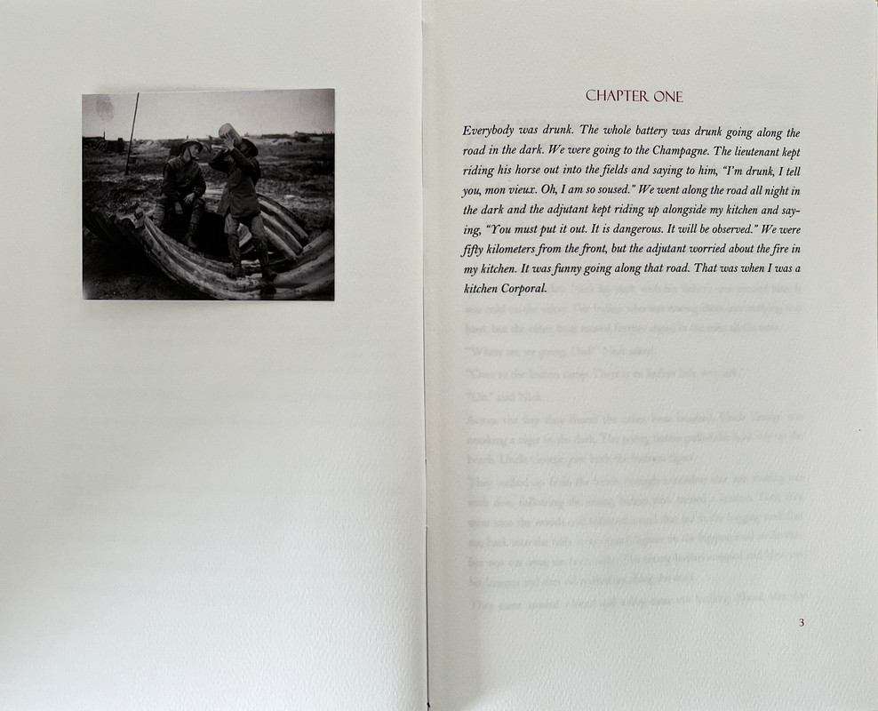
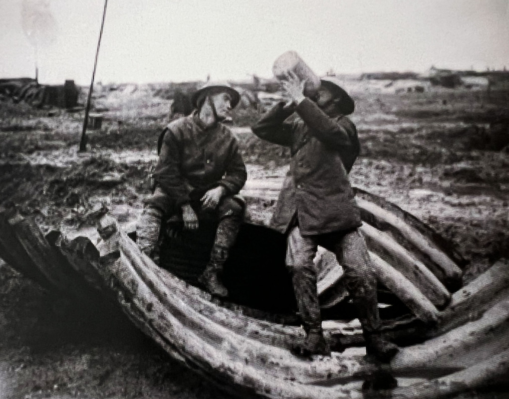
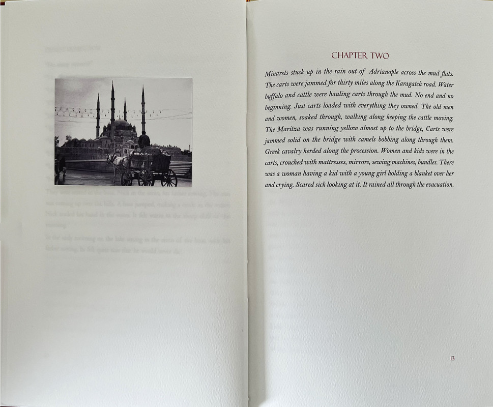
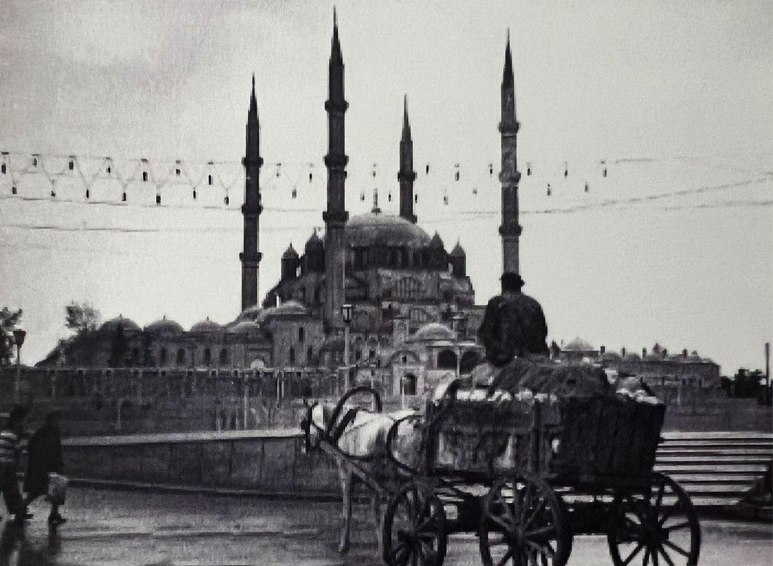
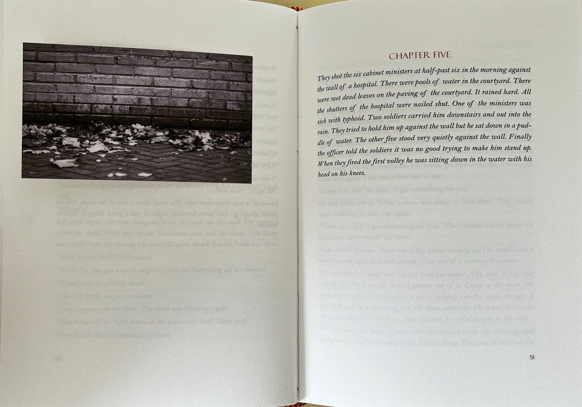
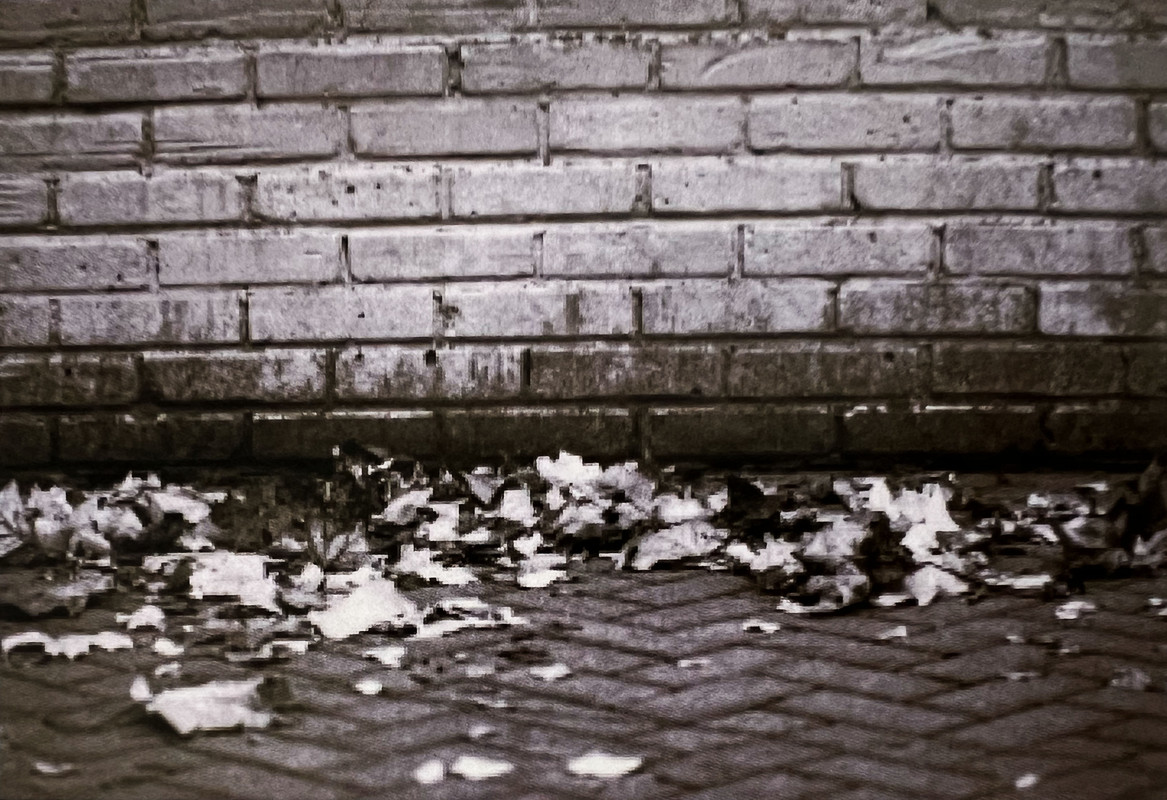
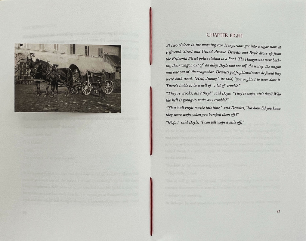
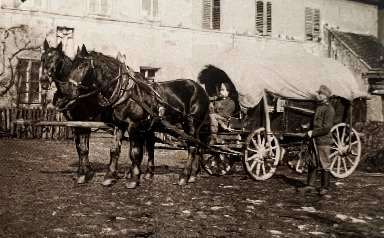
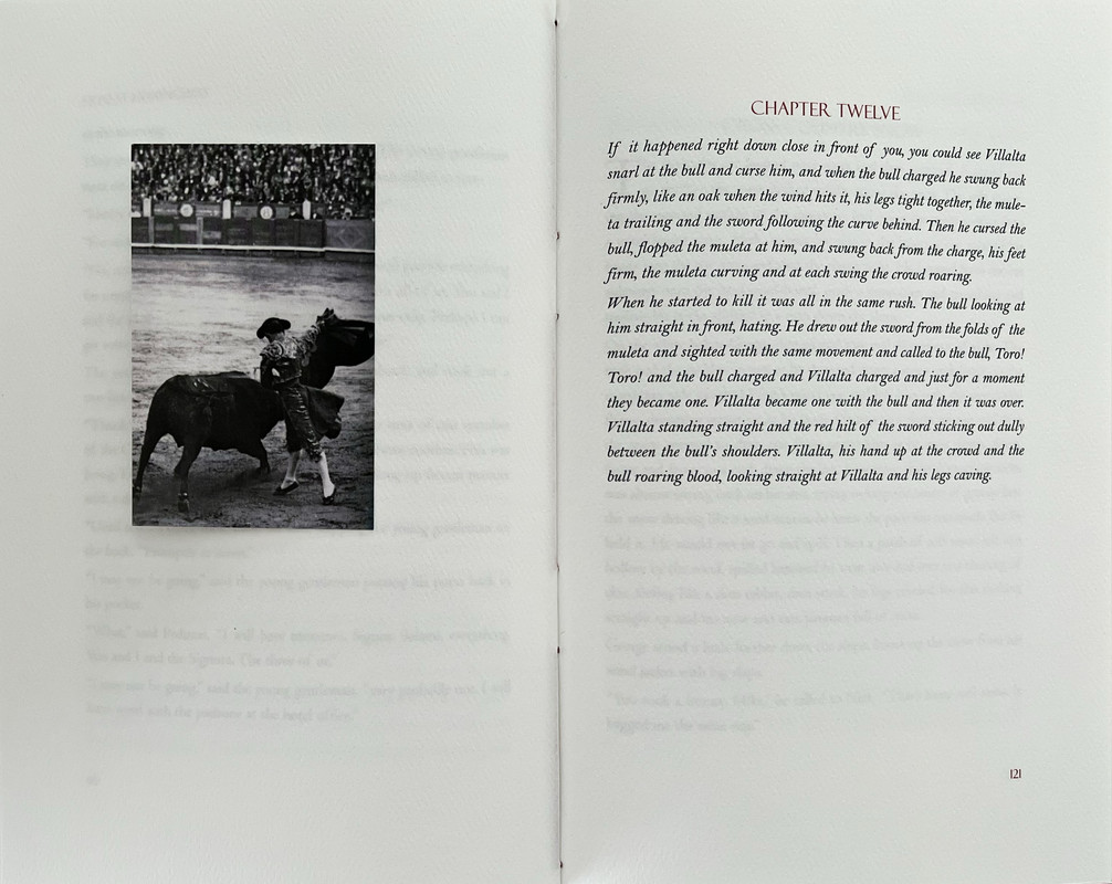
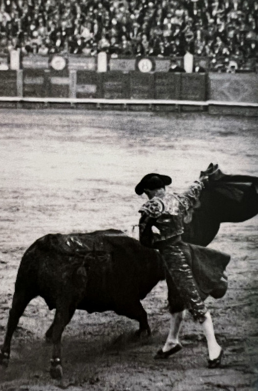
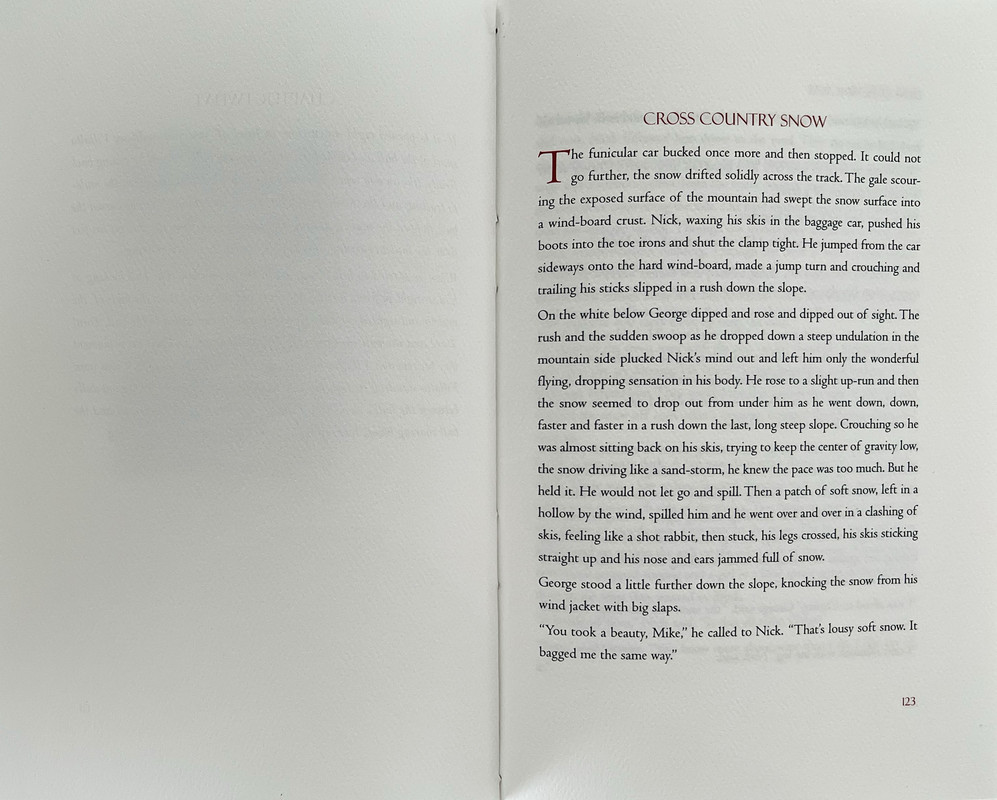
10 period accurate tipped-in photographs.
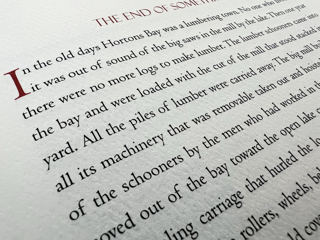
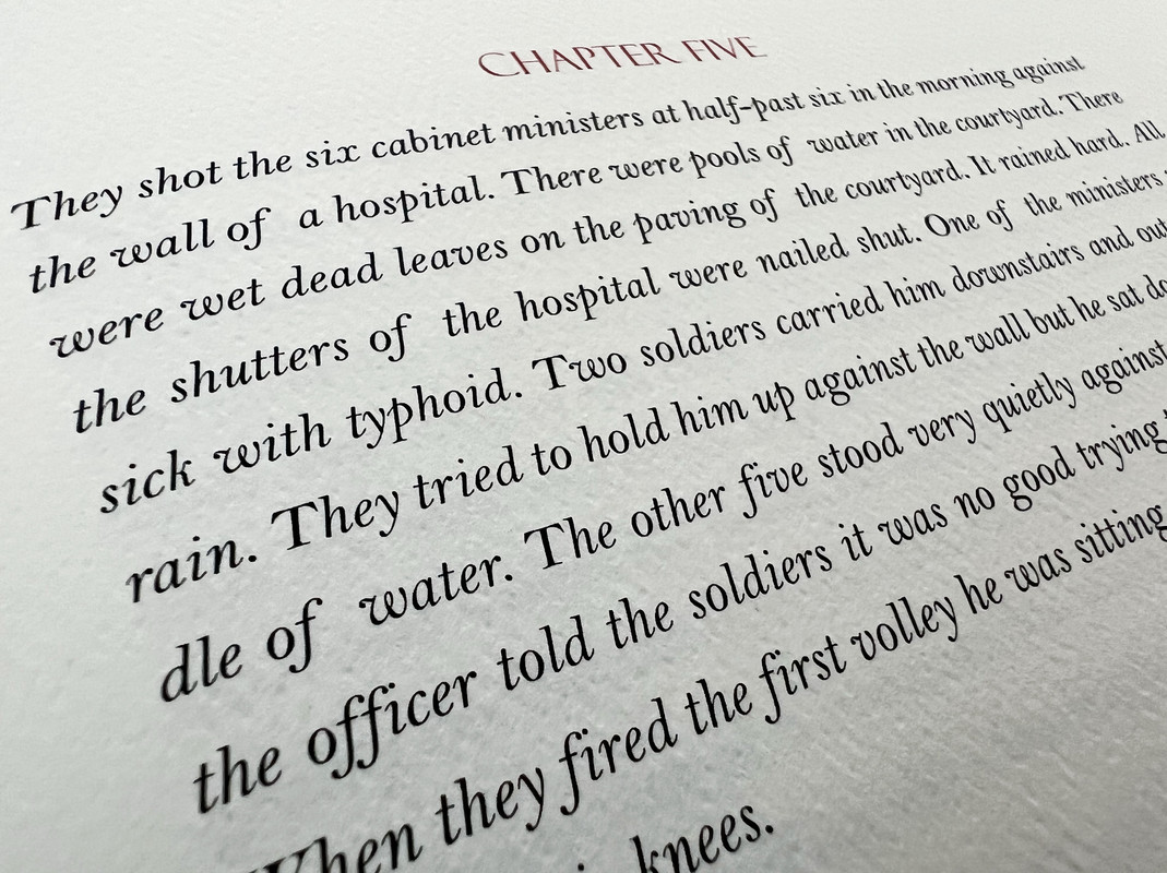
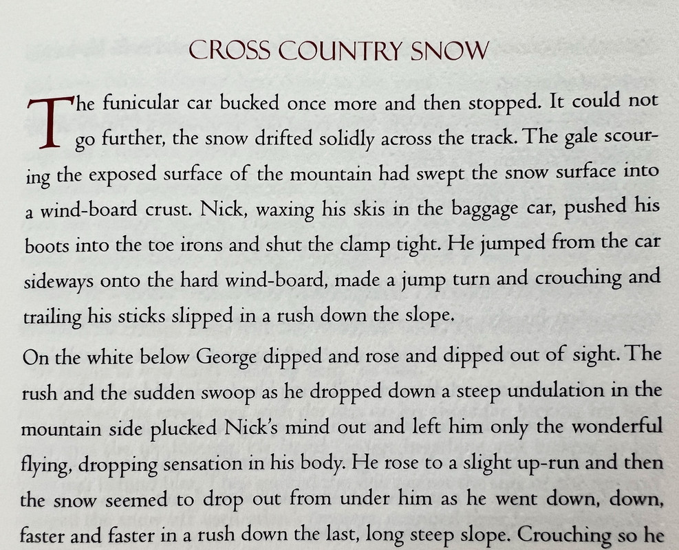
Printed on white felt paper with a high-end digital 4 color process.
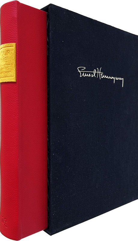
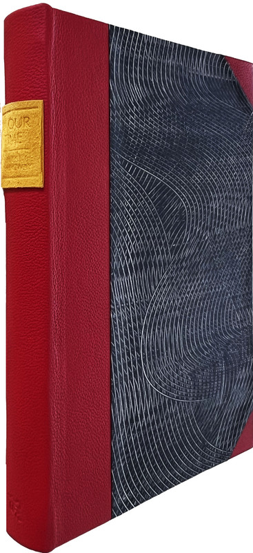
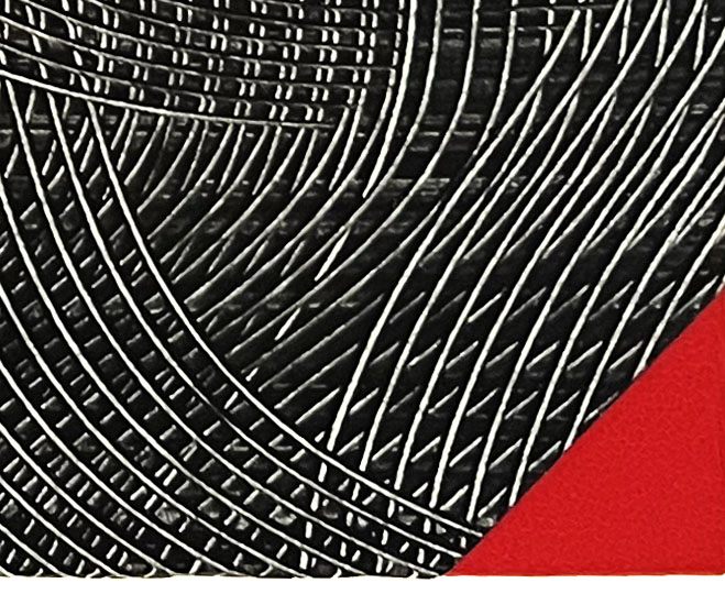
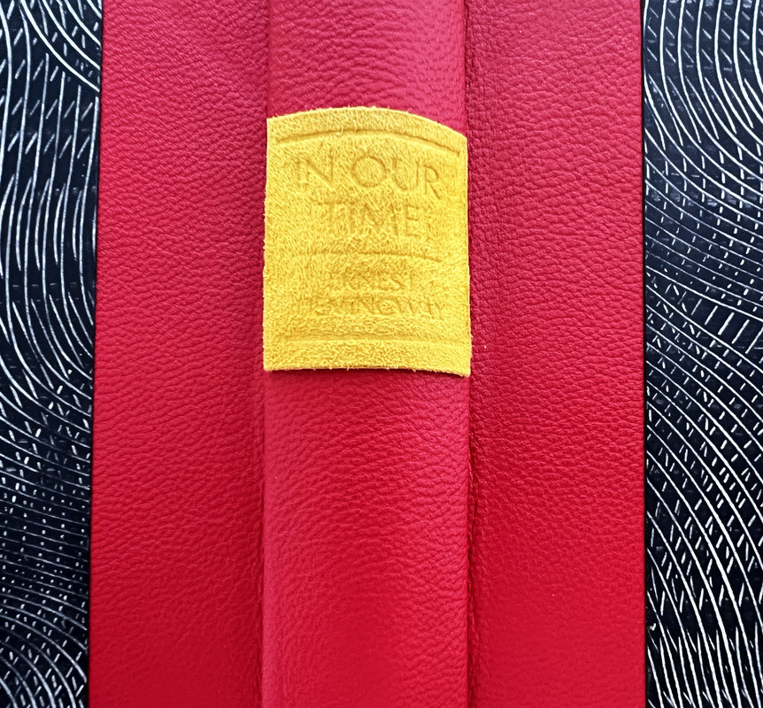
Half bound in bright berry red sheepskin leather with handmade pattern printed paste paper covers.
Title printed and blind stamped on yellow spine label.
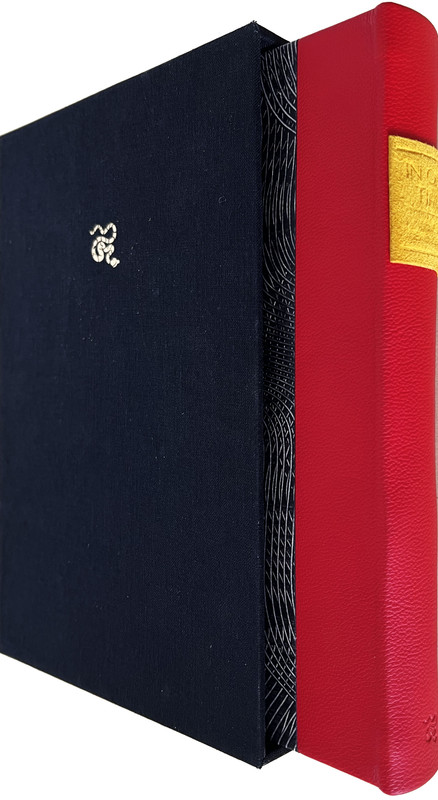
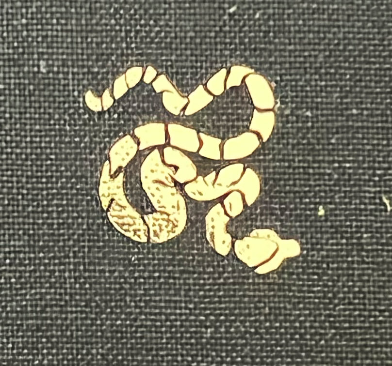
Copperhead Press logo blind embossed on bottom of the spine.
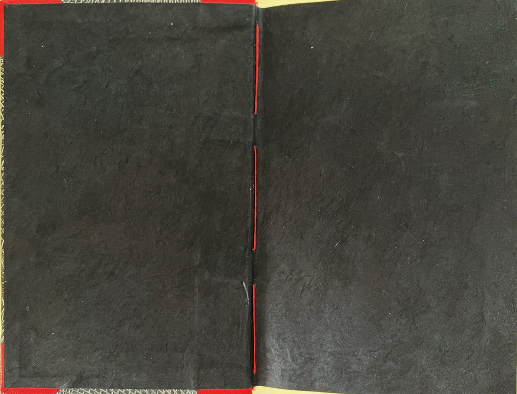
Endpages made of handmade black Lokta paper.
Text block hand sewn with red book binding thread.
Slipcase made of thick book board, wrapped in Verona Coal Black book cloth, gilt blocked with author’s signature on front and Copperhead on back, and lined with yellow paper.
23.4x15.5cm.
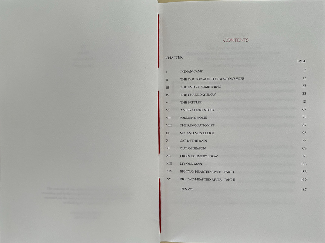
187 pages
US$350
These were some of the first short stories and vignettes written by Hemingway and first published between 1923 and 1925.


A the date of posting, copies were still available from the publisher at https://copperheadpress.com/products/in-our-time-1925-half-leather-numbered-edit...
An index of the other illustrated reviews in the this series can be viewed here.
A PICTORIAL REVIEW
First publication from Copperhead Press.
No. 1 of 50 copies.
Designed, hand crafted and signed by Chaz Ross and Katie Ross.
Forward by Chaz Ross.
10 period accurate tipped-in photographs.
Printed on white felt paper with a high-end digital 4 color process.
Half bound in bright berry red sheepskin leather with handmade pattern printed paste paper covers.
Title printed and blind stamped on yellow spine label.
Copperhead Press logo blind embossed on bottom of the spine.
Endpages made of handmade black Lokta paper.
Text block hand sewn with red book binding thread.
Slipcase made of thick book board, wrapped in Verona Coal Black book cloth, gilt blocked with author’s signature on front and Copperhead on back, and lined with yellow paper.
23.4x15.5cm.
187 pages
US$350
These were some of the first short stories and vignettes written by Hemingway and first published between 1923 and 1925.


A the date of posting, copies were still available from the publisher at https://copperheadpress.com/products/in-our-time-1925-half-leather-numbered-edit...
An index of the other illustrated reviews in the this series can be viewed here.
2ExLibrisDavid
This seems like a very impressive book for such a new press. Any thoughts on how it compares to others in your collection?
3wcarter
>2 ExLibrisDavid:
Very comparable with, and same quality as Thornwillow, but at a lower price.
Very comparable with, and same quality as Thornwillow, but at a lower price.
4edkennedy
>3 wcarter: But this isn't letterpress.
5Glacierman
Lovely book...but as was mentioned above, printed offset. Call this one a quality book, but not fine press.
6wcarter
I am one of the heretics who can appreciate a fine press book that is not printed letterpress.
7Ragnaroekk
This message has been deleted by its author.
8ambyrglow
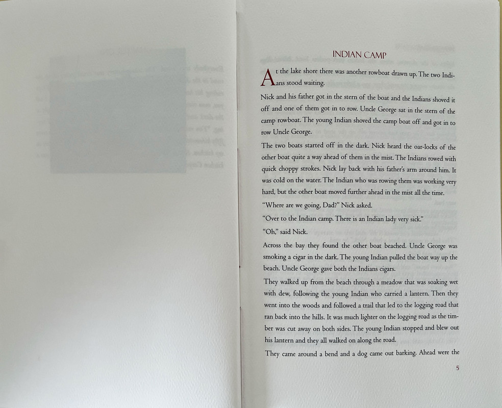
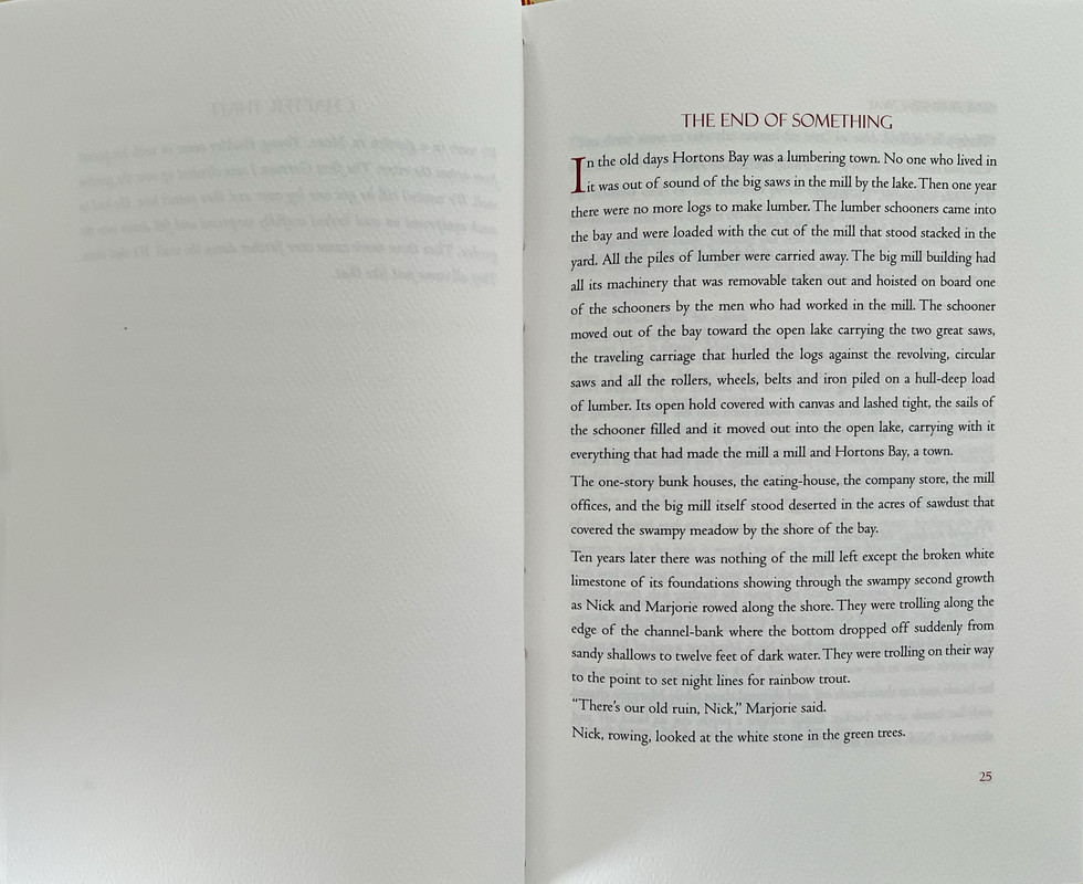
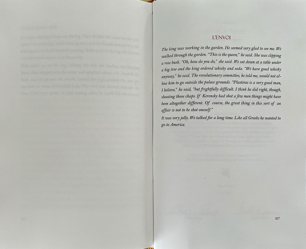
The typesetting choice to do nothing to indicate new paragraphs would make this a difficult read for me.
9sdawson
>8 ambyrglow: I agree. When did we stop indenting paragraphs? Did that get thrown out when the two spaces after a period was discarded?
10Pendrainllwyn
>9 sdawson: When did we stop indenting paragraphs?
Perhaps Hemingway didn't follow paragraph indenting norms and Copperhead has chosen to stay faithful to the original layout. I don't know that but I suggest the possibility because I note from Copperhead's website that "The 1924 edition of "in our time" (as opposed to In Our Time) consists of eighteen vignettes. The presentation was unique in its use of lowercase throughout and lack of quotation marks. Each short piece of prose was laid out at the center of the page and surrounded by huge amounts of white space. The idea behind the design was to highlight the narrative brevity, abruptness, violence and tone." So Hemingway does appear to have been trying things out at that time and if so I would prefer Copperhead retains that.
Perhaps Hemingway didn't follow paragraph indenting norms and Copperhead has chosen to stay faithful to the original layout. I don't know that but I suggest the possibility because I note from Copperhead's website that "The 1924 edition of "in our time" (as opposed to In Our Time) consists of eighteen vignettes. The presentation was unique in its use of lowercase throughout and lack of quotation marks. Each short piece of prose was laid out at the center of the page and surrounded by huge amounts of white space. The idea behind the design was to highlight the narrative brevity, abruptness, violence and tone." So Hemingway does appear to have been trying things out at that time and if so I would prefer Copperhead retains that.
11921Jack
>10 Pendrainllwyn: Looks like it was a design decision by Copperhead. They have added a bit of leading between paragraphs to separate them, but honestly I think they added enough for it to be a bit jarring as you're reading, but not enough to easily distinguish one paragraph from the next.
Btw the original edition does appear to have indents: https://youtu.be/R4CTFUtNiDI?t=191
Btw the original edition does appear to have indents: https://youtu.be/R4CTFUtNiDI?t=191
12Pendrainllwyn
>11 921Jack: Good sleuthing! Thanks
14Pendrainllwyn
>13 DMulvee: The lack of indentations didn’t impede my reading.
Me neither. I probably would find it annoying in a longer work
Me neither. I probably would find it annoying in a longer work

